Role: UX UI Design. Tools: Figma, Adobe Illustrator. Client: Payment Spayce.
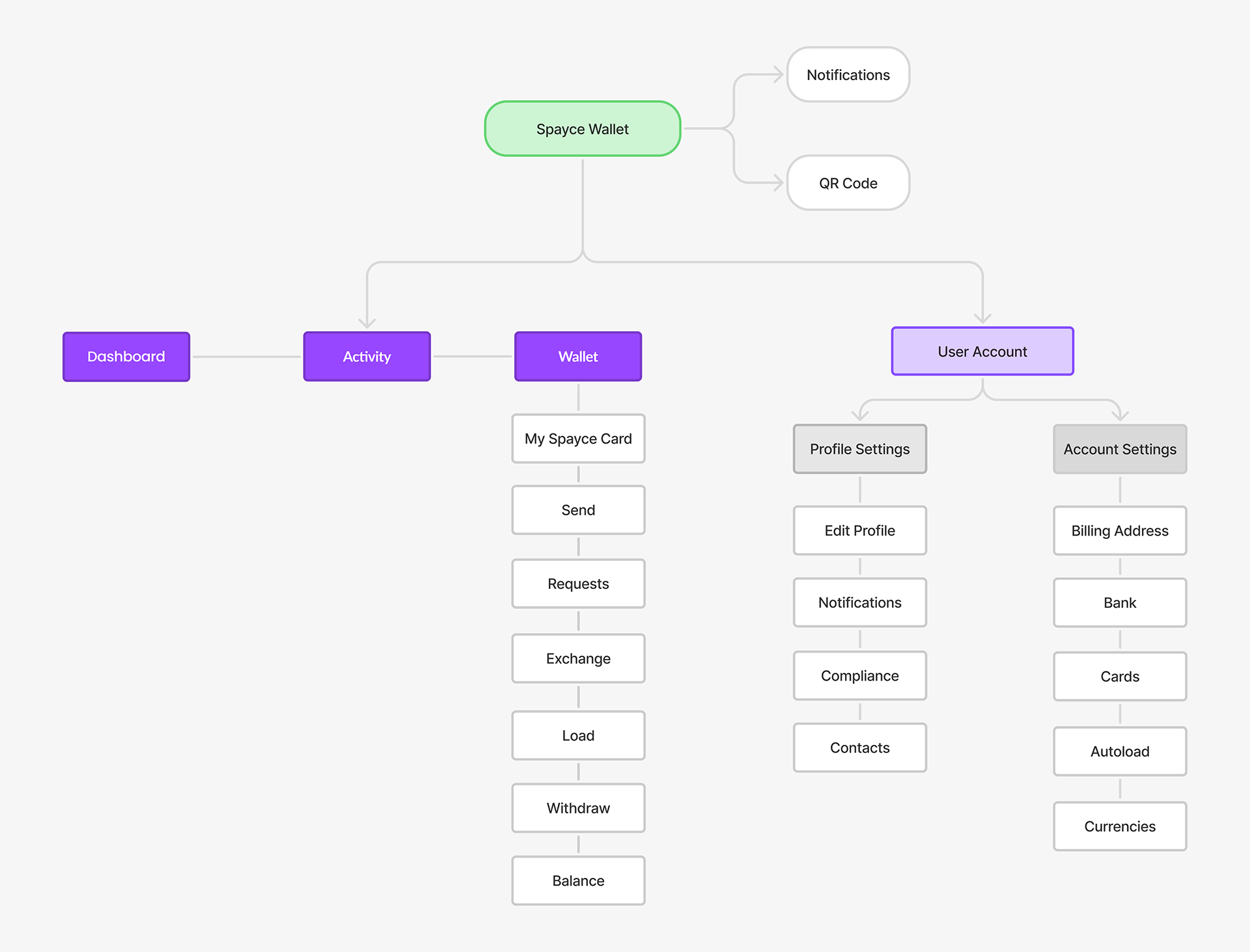
The app’s navigation structure is unintuitive, with poorly labeled menus and unclear pathways to essential features such as transaction history, bill payments, and rewards. This creates frustration, increases the time users spend searching for functions, and leads to frequent errors or abandonment of tasks.
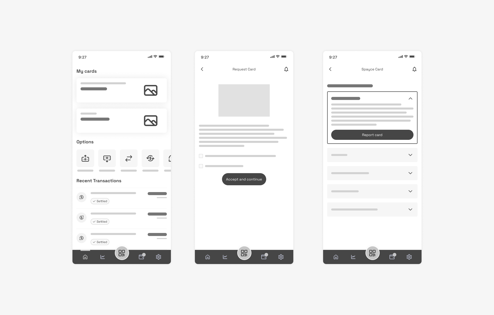
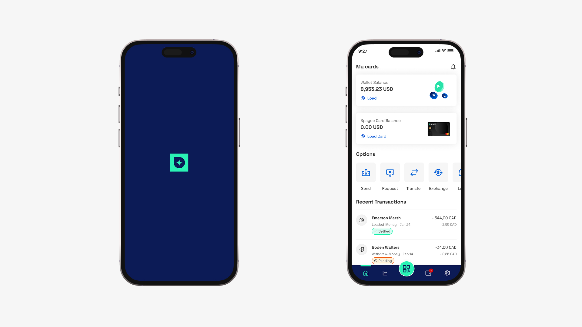
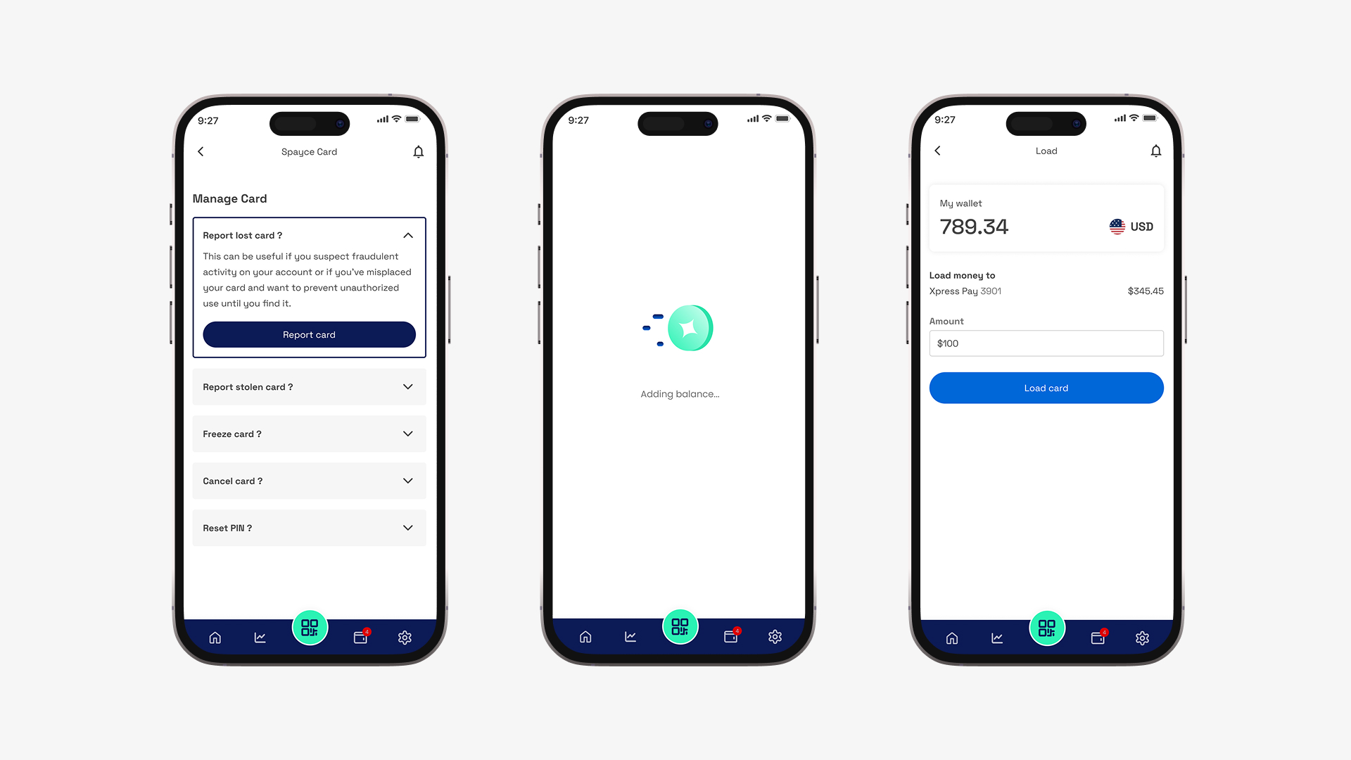
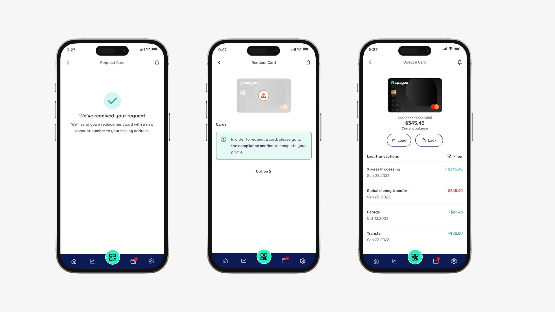
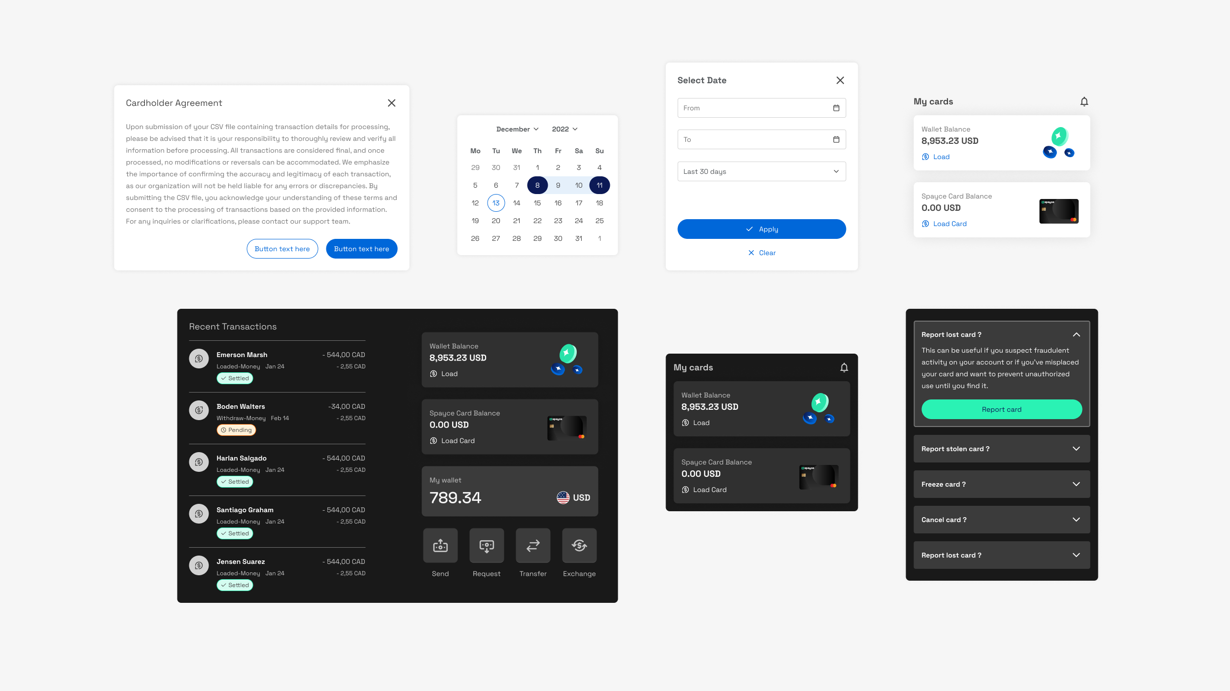
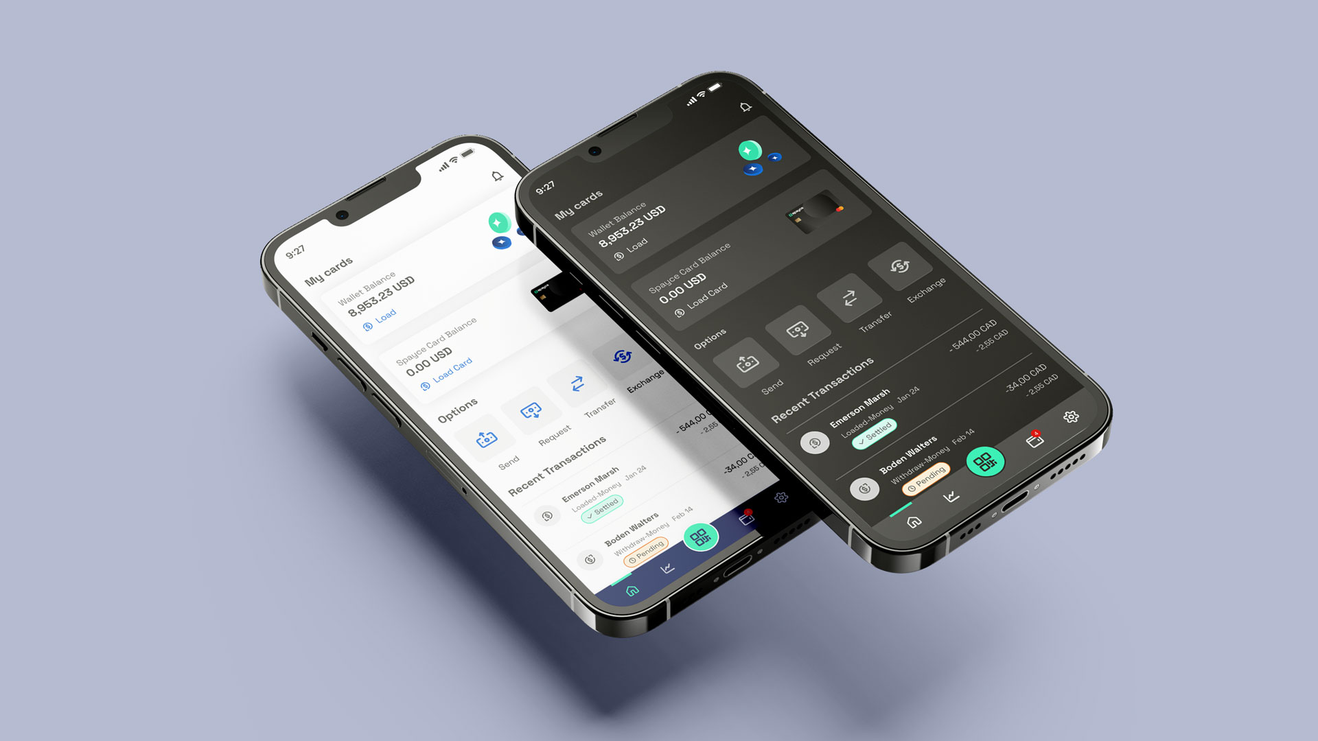
A simplified bottom navigation bar ensures quick access to core features like Home, Payments, Wallet, and Profile. Bold typography, iconography, and color-coded status indicators make it easy for users to scan balances and transaction statuses at a glance. Scalable text, proper contrast ratios, and inclusive iconography ensure usability for all users, including those with visual impairments.
